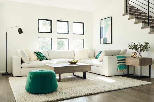
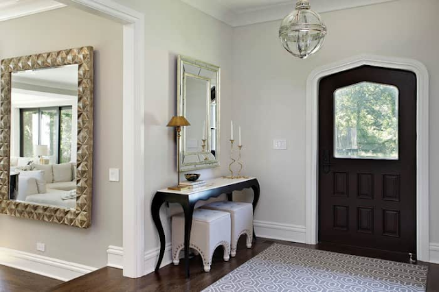
With a few simple design ideas, you can make a small space feel much larger
Your living area may be smaller than you prefer...but it does not have to appear that way. There are numerous very simple design ideas, centered on the notions of size, light, and movement, that you can use to fool the eye into experiencing a bigger feeling of space.
While it's tempting to focus on the negative aspects of smaller rooms, don't overlook the benefits: there's less vacant wall space to decorate, less to clean, and the compact area will likely prevent you from putting needless goods there (aka developing clutter). Here's how you make the most of such little places by making them look larger than they actually are.
Declutter
You knew this was going to happen, didn't you? The first step in generating the perception of more space is, well, making more space. Every room-enlarging endeavor that does not entail actual renovation must start with a thorough, deliberate decluttering. This involves getting rid of bulky or unneeded goods, leaving vacant space on open shelves instead of stuffing every square inch with books, picture frames, vases, and trinkets, and putting all unwanted items (including additional blankets and that tenth throw cushion) out of sight. If it isn't contributing to a more open sense in the room, relocate it or get rid of it.
Keep your furnishings in proportion to the size of the room
Downsizing the furniture in a room is one of the simplest methods to make it appear larger, since no item should be too massive or bulky for the area. Any items that extend to the room's edges are too large and should be replaced. Allowing space between the sides of your furniture and the walls will provide the illusion of air movement and space. And, sorry, La-Z-Boy fans—sleek, basic designs are preferable to anything with cushy, overstuffed cushions. Additionally, position furniture such that it does not obstruct any of the primary light sources in the space.
Select "leggy" furniture and lighting fittings
Select chairs and tables with exposed legs, as well as streamlined light fixtures with slender arms and few lights, to create a sensation of light, airy movement. Furniture and fixtures with thin frames and exposed legs provide a sensation of air circulation in open areas and can appear to float. These optics deceive the sight and mind into believing they are in a larger place. Consider wrought iron, as well as glass and lucite that can be seen through for extra impact.
Keep furniture and wall accents to a minimum
Keep furniture and wall accessories near to the ground to create the illusion of greater vertical space. Consider ottomans, low tables, and Mad Men-style sofas. Consider mid-century modern and 19th-century items, which are often lower to the ground. You may avoid using an elevated bed frame entirely by placing your mattress and boxspring directly on the floor—or you can raise your sleeping experience with a loft bed. (While this goes against the "keep it low" guideline, it accomplishes the fundamental purpose of allowing plenty of vertical room.)
When it comes to art, disregard the conventional wisdom that wall accents should be hung at eye level and instead put them lower and closer to the furniture, leaving free space above. Designing with fewer, bigger accents is preferable than decorating with numerous smaller ones, which may make a place appear cluttered.
Go white, really white
When it comes to making a space look larger, the power of the color white cannot be underestimated. Its reflecting nature enhances light, instantly making a space appear brighter and more airy. According to Remodelista, painting both the walls and the ceiling white "serves to blur the boundaries between wall and ceiling, leading your eye to move up, ultimately making the ceiling look taller."
Don't be concerned about the place being overly sterile. Accent colors and textures such as grained wood, antiques, woven baskets, soft tan leather, sheepskin rugs, greenery, and warm metals such as brass or brushed gold make it simple to brighten and warm up a space.
Include vertical lines
Emphasizing ceiling height might draw attention away from the tiny size of a space. Tall shelves, vertical shiplap, beadboard, lined wallpaper, board-and-batten wainscoting, or single hanging lights may all be used to drive the eye up, up, and away from any concerns about the room's small size.
Mirrors, is the word
Mirrors are one of the most valuable tools in any interior designer's arsenal, particularly when it comes to making tiny spaces appear larger. Place mirrors strategically around your rooms to reflect light and the view from your windows, giving the illusion that the mirror is another window. (Mirrors opposite windows and at the ends of short corridors frequently have the greatest visual space-creating impact.) Use wall mirrors, mirrored chests, and accent trays rather than enormous, heavy, standing mirrors that take up valuable floor space.
Leave the windows and flooring unadorned
This means no – or very few – curtains, drapes, or carpets. Curtains provide another (long) element to the eye's attention, which might register as clutter and make windows look smaller. They also, unavoidably, obstruct light and visibility. If you do decide to use curtains, choose a sheer, lightweight version with a pole that goes beyond the windows so they may lay completely to the side of the window when open.
Exposed flooring reflect light, giving the impression of larger space. While a rug-free house may not be your style, consider lowering the number, thickness, color, or complexity of designs on your rugs.
Select light textiles and colors
Heavy textiles like velvet, wool, flannel, tweed, suede, and faux-fur can visually take up more space and make a room appear more filled than it is. Choose cotton or linen-based textiles for a lighter, more airy feel. (If you choose a heavier fabric, keep the fabric color light.) Avoid brown, black, and dark blues in favor of softer neutral tones that may be accented with flashes of color.
Make a well-defined walking path
It's natural to want to place your furniture in the center of a room to create symmetry. When working in a limited area, however, first focus on building a clear, open passage through the room so it doesn't appear to be an obstacle course or a one-way ticket to landing on your face. Check that no furniture is blocking the natural route. Taller items should be placed towards the walls, while shorter ones should dominate the main area. You'll not only look better, but you'll also trip less.
#SmallRoom #LooksBig #Furniture #Mirrors
SOURCE: lifehacker
What do you think of this blog? Write down at the COMMENT section below.


No comments:
Post a Comment